Pages

Modules

Sunday 5 June 2016

Module Evaluation: OUGD603


I feel like this module has taught me a lot, in regards of myself as a designer and a young person, and what I want to see myself doing. 

My most enjoyed element of the module has been finding concepts, and really working them through with ridiculously through research. I personally believe that my strengths lie in research and developing ideas. Research gives me the ability to actually understand what I am creating and therefore can only improve and aid my design work. I pride myself on being informed or prioritising being informed on the topic of what I'm creating. This year has allowed me to build up a knowledge in various topics, due to its freedom to explore.

I've enjoyed being able to work through problems and dilemmas and finding ways around it, or correcting them when found. To then be able to take whatever has been learnt and put into practice I have found incredibly gratifying. I've learnt so much from outside sources (studios, visiting speakers, teachers) that helps my journey and process as a creative.
Although this year I have no achieved what I had hoped to due to reasons, I am constant proud of my work, as it always changes with time, knowledge and a greater understanding of the methods needed to be better.
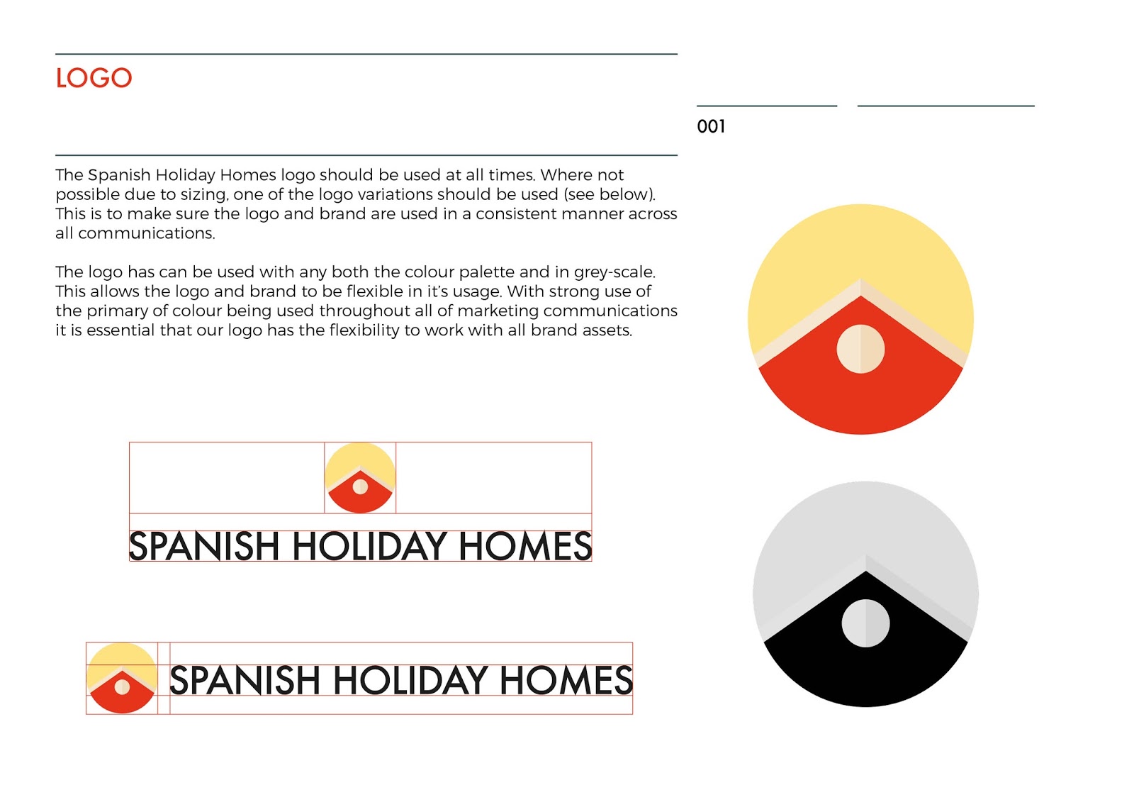
I've explored mostly branding this year. Toward the end of level 5 I was very comfortable with branding being a strain I wanted to further explore. I enjoy the process of having to encompass feeling, or idea, or personality though visual mediums. 
There are always things I could do better, I'm ever changing as a designer. Looking back, I wish I had been around to focus on my work more, as pieces or work and entire prints have ben lost to me in the process of this year. I would also like to focus on presenting final pieces, as supposed to digitally rendered versions. Inconveniences like this I often feel make my work incomplete despite my development work being strong.

I've enjoyed the work this year, despite everything else. And although what I present is not what I ever intended, I am proud of what I've been able to achieve, what I've learnt as a student, and what I will learn, after leaving.


Archer: Instagram Video

Beth mocked up these examples of how the promotion would work in Instagram. They are very effective and add context to the advertisement.


Spanish Holiday Homes: Final & Evaluation


This brief was to create a visual identity for an existing company, that acts as the middle man between holiday home owners and those looking for holiday rentals. It is a small company that handles the interactions, and prides itself on customer services.

My role was the create a package for the client, that would communicate clear direction and simplicity.
This brief was enjoyable, the client was open to more engaging and bright palettes as supposed to a corporate route seen with many other realtors do. The company is young although dealing with clients of all ages. It also represents holidays, which are fun, communicated by the bold playfulness the brand encapsulates. The clients descion to stay away from generic holiday images in the printed contact pieces has enhanced the overall aesthetic, and prevents the brand from appearing dated, or generic. Overall this brief has been successful and I look forward to expanding the brand and continuing to work with this client.

Saturday 4 June 2016

Spanish Holiday Homes: Brand Guide

I created a simple set of brand guidelines for the client, to better deliver to them the new identity. Brand guides are very effective when it comes to presenting your final idea to the client. They are clear and visual aid that allow the client to believe in the design, seeing how it could positively affect their company in its current state.


Rap Cards: Finals & Evaluation


Spanish Holiday Homes: Development

The main thing I was asked to create were business cards. After finalising the logo the next step was deciding how to utilise both colours. I played with angles, similar to the ones seen in the picture logo to create interesting shapes.


I felt the lines were too distracting and the flush primary colour was a lot more engaging. I incorporated the same degree of angle into the back of the card carrying the same concept throughout.


I also had to find a secondary typeface, to accompany the title. This took quite a while but eventually I whittled it between Futura and Beauchef W00 Book (Regular) and the latter was more suitable. The rounded glyphs worked well with the harsh title typeface.

I then went on to the letterhead. The client asked for simple stationary mock-ups, incorporating the brand into a letter head that would be sent to clients. I worked with the same angle. Rearranging the footers allowed for correct spacing and boundaries. 


Friday 3 June 2016

Spanish Holiday Homes: Typeface

I wanted the typeface to be clean and corporate. My client is warm and bubbly, but I had to remove the headspace of 'personal branding' and understand that this company was an umbrella for many different home owners of all ages, ethnicities and genders, as well as clients of the same variety.

Here are developments when choosing a typeface that expresses the correct the right tone of voice. I preferred the sans, and continued in that direction.

Helvetica light, Futura Medium and Lemon/Milk was a favourite. I experimented with Helvetica, creating a smaller format for the icon and type logo.

Eventually I stuck with Futura Medium. Alongside the finished logo it was clean and simple. The bright colours injected the personality, due to such a corporate typeface.


Spanish Holiday Homes: Logo

Beginning steps were to establish a strong shape /icon that could carry the identity. Many other real-estates I looked at had a strong visual image that accompanied their title. I Couldn't change the company name 'Spanish Holiday Homes' which is far from catchy, so I wanted to create a strong visual that would carry past the overly descriptive name. 

I began by playing around with very simple shapes. Using the Spanish flag as a spring board for many. It's within the title and the main selling point of the client's properties.

The shapes began with the flag and graduated into subtle house visuals, as seen in the other examples. I liked the circular base and began to play with the 'roof' shape, using colours to play with depth.

Once the shape was established I experimented outside of the red and yellow just to educated myself on the other iterations.
They all were nice, however toward the end I did like the idea of the colour concept comming directly from the spanish flag, so a different version of the red & yellow was kept.


Thursday 2 June 2016

Spanish Holiday Homes: Statistics & Data

Before designing I requested some data from the client: who their target was, who used their services etc. Just to get a better understanding of her target audience and just how large it was. It was after this conversation I realised how much print would have to be able to be translated into Spanish if they decided to go forward with my proposals, type and legibility will be factors that affect this.

Houses:
  • What are the main nationalities showing interest?
    Swedish, Danish.
  • What are the family sizes?
    1-2
  • What age groups are the renters?
    Over 25 and under 65
  • What are their incomes (manual labourers, professionals, full time/part time etc.)? Professional or retired, mainly.
  • Roughly what percentage speak English?
    25%

Apartments:

  • What are the main nationalities showing interest?
    English and Spanish
  • What are the family sizes?
    2-4
  • What age groups are the renters?
    25-65
  • What are their incomes (manual labourers, professionals, full time/part time etc.)? Mainly professional.
  • Roughly what percentage speak English?
    75% (Most clients speak some English)
Below, is further statistics requested from the a tourism board within the areas that my clients works within. Although a lot wasn't helpful to me, I find data very interesting and it was intriguing to learn about the numbers and age groups that my client would be dealing with.


Spanish Holiday Homes: Real Estate Branding

I began by look specifically into logos of existing realtors as well as sales and letting agents. Starting with famous UK companies, a common theme throughout was the use of an icon, picture logo, that accompanied the title name. They all had recognisable logos, that were bright and engaging.


Haus, utilise the bold little house shape, that stands out among their otherwise very modern yet corporate branding. It keeps the brand fun, yet professional.

Colour is used similarly in the Keepmoat and Rightmove brands. Bright colours works alongside simple, clean and 'corporate typefaces. These brands are successful due to this careful balance.

Property branding is plastered everywhere, on houses - mainly, but online, adverts, housing developments etc. It has to be something memorable, or eye-catching.

With the state of the economy, booming house prices continue to be huge problem and now, is a very scary time to get involved into anything rent, anything mortgage in terms of affordable housing. Many 'high-end' realtors have found themselves having to re-brand, in order to widen their target market. A certain aesthetic: (serif type, muted colours, delicate branding) essentially screams 'money' which is putting off younger buyers, who don't have the same amount of money that elder buyers - second home buys do. Below, a modernisation of Sotherby's Reality Logo, to reflect their growing target audience and the properties they offer.


Even in London, an incredibly expensive market, sales and lettings offices are resorting to loud, bold, simple graphics to encourage the eye and draw in younger crowds, positioning themselves as approachable, simple and perhaps to be perceived as 'cheaper'


The take away from this is to be able to create a brand that looks professional and clean but similarly, loud and young. The balance of professionalism and approachability is key to create a successful real estate brand, a business which involves and such a broad audience.

Spanish Holiday Homes: Brief

Brief: To create a young, engaging, visual identity for the existing company 'Spanish Holiday Homes'

Background Considerations: Spanish Holiday Homes is run and maintained by one person the client. They are in the process of increasing in size and wish to a bigger following and more clients. The client wants a visual identity that will communicate a simple, straight forward and easy process when it comes to looking for properties in Spain and its surrounding islands.

Deliverables:
Brand Logo
Business cards
Brand Guides
Misc Components (letter heads etc.)

Feathr: Evaluation


Having the boundaries of only having only a set amount of colours was enjoyable. Looking back at the designs they do look very different from each other, but in defence they are direct representations of each game. The choice to simplify the shapes from their traditional retro pixel was to create modern styles using the games as a starting point. As mentioned last year, when Feathr was done with a similar concept, it's 'undercover nerd culture'. Creating a pattern that is approachable, commercial and clean, but with a very 'cult' undertone. Much was learnt about RGB colour and how to re-create an original aesthetic respectfully. 
The wallpapers are successful, and in my own time I'd look to carry on a similar series, perhaps into textiles, using the same palette and keeping the 8-bit shapes. I'd like to truly explore the NES aesthetic much further without the constraints of approachability. 

Thursday 19 May 2016

Personal Tutor - Finals & Evaluation


Though this brief was incredibly simple and straightforward the research that informed the final peice. To understand the market, and the audience that your designing for is incredibly important and the research elements I explored in this brief, defiantly helped that. To then be able to form the research into a practical element is very satisfying for me. I do enjoy branding, and I feel its wear my strengths lie, particularly personal branding, as client is completely different from the next, and i'm able to create things look different but have the same underlying strength of concept and research.

The client was very pleased with the final outcome, and the fact that was I able to work back and forth quickly with him. Allowing clients to become part of the process and development is important. By the client being able to personal produce something that could be used within the final outcome was very satisfying for them. The brief was fulfilled, lead by research, practicality and client feedback, and was an overall success.

Personal Tutor - Blue

Moving on from the red colour after all the colour theory research. Beginning with the original text layout I began to play with the secondary colour. Using guides and sizing to ensure consistency on both sides.


I swapped the black out for a darker blue at first, as the black was very harsh. Now working with the blue I feel more comfortable with the design. The first didn't have a clear tone of voice. Again, it was too contrasting so I stuck with only one colour. The longest part of this process was re-defining the writing as the quality was so low res.


I then went on to create some clean, simple icons to use alongside the contact details. In black, they anchored the text and allowed them to stand out. I also added a light weight line to establish the information from 'decoration'.


The last few descions were just the opacity of the text. At 100% it was too distracting, but too little it became grey and unattractive. I'm really happy with tis new version as it is brighter, engaging, simple and clean.